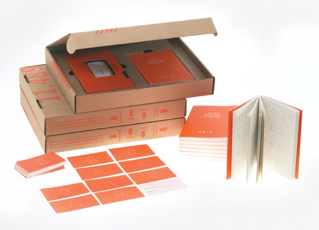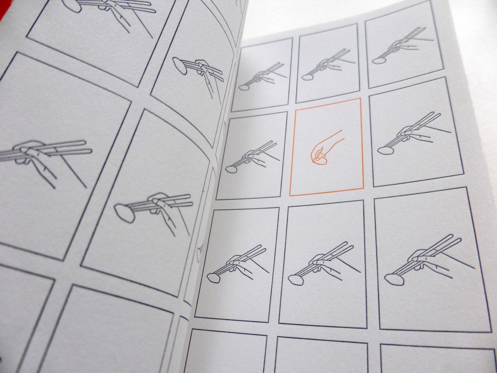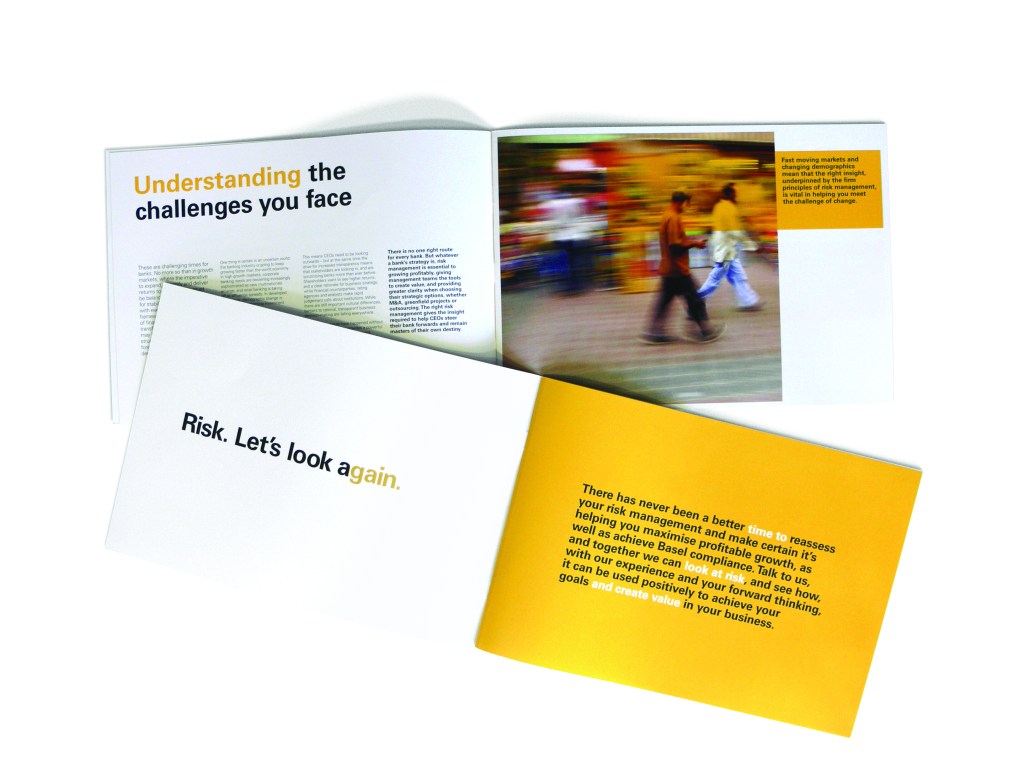

This is a small book and a favourite piece. It’s quite minimal (although I can be maximal at times), but with a little ‘twistedness’. It’s serious but a bit funny. It’s silkscreened, de-bossed, bright orange and tactile. It is few words, but it was designed to feel like an important pocket-sized book. We wanted it to imitate something communists or other ‘believers’ would carry around in their breast pocket. I worked to a tight brief and with an inspirational copywriter and creative director, Marty Cooke while in New York at SS+K. The work I did with Marty and my design director Alice Ann Wilson makes me very happy. We’ve all moved on from SS+K now but the work I did there was formative and, looking back, this book says a lot about me as a graphic designer. it slotted sweetly into a box which we posted out. i was also the designer and illustrator of all the brand identity as it developed, pictured below mostly. all with this juicy orange and the ‘municipal chic’ idea. The website worked and was styled as a microfiche concept. That ages me.
